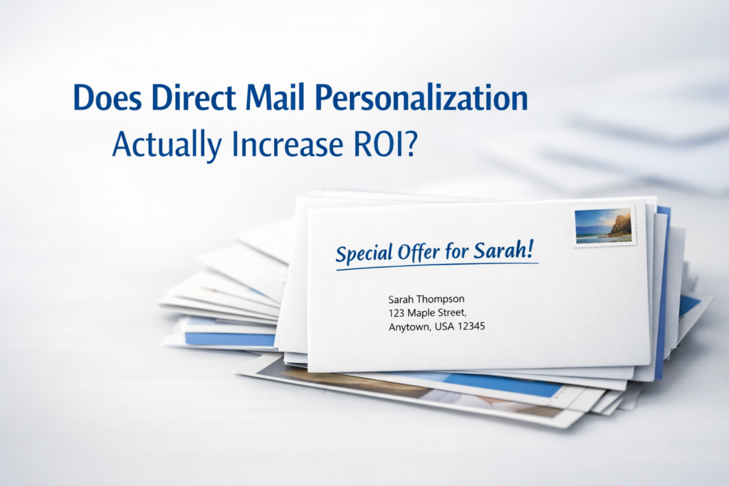
Marketing works better when people feel like the message was created specifically for them. That is one reason personalized marketing continues to grow. Businesses and nonprofits want to connect with customers in a more direct and meaningful way. One of the best tools for this is variable data printing.
Variable data printing allows businesses to customize printed materials for different recipients without slowing down the printing process. Instead of sending the exact same postcard, letter, or flyer to every person, you can personalize details like names, locations, offers, images, and more.
At Inkwell Printing Company, we help businesses and nonprofits use variable data printing to create more effective direct mail campaigns and printed marketing materials. Here is what variable data printing is, how it works, why it matters for your marketing strategy, and what we have learned over our 30 years in business.
What Is Variable Data Printing?
Variable data printing, often called VDP, is a digital printing method that changes certain elements within a print piece from one copy to the next.
These changes are pulled from a mailing list or database. The overall design stays the same, but personalized information can be added automatically during the printing process.
Examples of variable information include:
- Customer names
- Company names
- Addresses
- Custom offers
- Personalized headlines
- Different images
- Unique coupon codes
- Membership numbers
- Donation amounts
For example, a nonprofit organization could send donation letters that greet each donor by name and reference their previous giving history. A local business could send postcards featuring offers based on a customer’s past purchases.
How Variable Data Printing Works
Variable data printing combines a print design with a customer database.
The database contains the information you want to personalize. The printing software connects that information to the design template and automatically updates each printed piece as it is produced.
This process allows thousands of unique pieces to be printed quickly and efficiently.
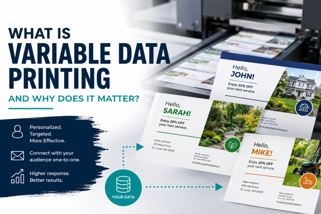
A basic example could look like this:
- John receives a postcard with a discount on landscaping services.
- Sarah receives the same postcard design but with an offer for lawn maintenance.
- Mike receives a postcard promoting seasonal cleanup services.
The layout stays consistent, but the message changes based on the recipient.
Why Personalized Print Marketing Matters
People receive countless marketing messages every day. Personalized print materials help your business stand out.
When customers see their name or receive an offer that matches their interests, they are more likely to pay attention. Personalized marketing feels more relevant and less generic.
Studies have consistently shown that personalized direct mail campaigns often generate higher response rates than non-personalized campaigns.
Variable data printing helps businesses:
- Increase response rates
- Improve customer engagement
- Build stronger customer relationships
- Create more targeted campaigns
- Reduce wasted marketing costs
- Improve return on investment
Instead of sending one general message to everyone, you can create marketing that feels more specific and useful.
Common Uses for Variable Data Printing
Variable data printing works well across many industries and types of organizations.
Direct Mail Campaigns
Direct mail is one of the most common uses for variable data printing. Businesses can personalize postcards, letters, brochures, and promotional pieces for different audiences.
This works especially well for:
- Retail promotions
- Service reminders
- Real estate marketing
- Healthcare notices
- Membership renewals
- Political campaigns
Nonprofit Fundraising
Nonprofits often use variable data printing to strengthen donor communication.
Personalized donation appeals can include:
- Donor names
- Previous donation history
- Suggested giving amounts
- Custom messaging based on donor activity
These details help donors feel more connected to the organization.
Customer Loyalty Programs
Businesses can use variable data printing for loyalty mailers, coupons, birthday promotions, and special offers.
A personalized coupon is often more effective than a general advertisement because it feels more relevant to the customer receiving it.
Event Invitations
Custom invitations can include personalized attendee names, seating information, QR codes, or event schedules.
This creates a more professional and organized experience for guests.
Variable Data Printing and Mailing Services
Variable data printing becomes even more powerful when combined with professional mailing services.
Combining printing services with mailing services can help businesses:
- Save time
- Reduce errors
- Improve mailing accuracy
- Meet USPS requirements
- Streamline campaign management
Handling everything through one provider also simplifies communication and project management.
Is Variable Data Printing Expensive?
Many businesses assume personalized printing is expensive, but digital printing technology has made variable data printing more affordable than ever.
For many campaigns, the improved response rates offset the additional setup costs.
Variable data printing can actually reduce waste by helping businesses target the right audience instead of sending generic marketing materials to everyone.
A smaller, highly targeted campaign often performs better than a larger untargeted campaign.
Tips for Successful Variable Data Printing Campaigns
To get the best results from variable data printing, keep these tips in mind:
Use Accurate Data
Your campaign is only as good as your mailing list. Make sure names, addresses, and customer information are current and accurate.
Keep the Design Simple
Personalization should improve the message without making the design feel cluttered.
Segment Your Audience
Different customers respond to different offers. Divide your audience into groups based on interests, demographics, or buying behavior.
Include a Clear Call to Action
Tell recipients exactly what you want them to do next. This could include:
- Visiting your website
- Calling your office
- Using a coupon
- Making a donation
- Scheduling an appointment
Track Results
Use coupon codes, QR codes, or campaign tracking methods to measure the effectiveness of your campaign.
Final Thoughts
Variable data printing helps businesses and nonprofits create more personalized and effective marketing materials. Instead of sending one generic message to everyone, you can create targeted print campaigns that connect with people on a more personal level.
Whether you are sending postcards, donation appeals, promotional letters, or event invitations, personalized printing can help improve engagement and increase response rates.
If you are interested in using variable data printing for your next campaign, Inkwell Printing Company can help you create professional print materials and mailing campaigns that deliver results.
Contact us with any of your printing and direct mail needs!
For more helpful information check out our blog at: /advice-from-the-printer/
And for more information on Inkwell Printing Company check out our website at: www.inkwellstl.com